A book is a user interface, and game books require layout decisions that traditional just-for-reading or just-for-gleaning books do not.
Here’s an example of something I learned doing d20 System books, back in the day, which came up again when doing the book design for the Descent Quest Compendium: maps don’t always belong as close as they can get to the text about them.
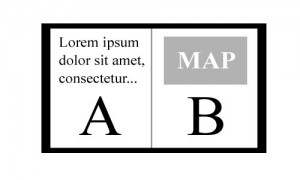
Let’s say a map and its associated key or legend takes up a page and some change. You want to put the legend right near the map, obviously, but you may also have passages of text that go with the map, describing mapped rooms, for example. Your instinct might be to place that text as close to the map as possible, maybe onto the next page. Sometimes that’s the right call. Sometimes it’s not.
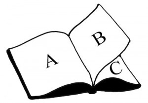
You want the reader to be able to read the descriptive text (or as much of it as possible) while also eyeballing the map, and if the map and its associated text are on two sides of the same page, that’s impossible. The user has to flip the page back and forth, glancing and reading in turn. If you put the map a full page away, though, the user can hold one page up and glance from one page to the other (from Page A to Page C) without flipping
For example, imagine that the map on Page B has text that spills over off of Page A, through Page B, to the back of Page B. You can’t look at the front and back of Page B at the same time, but you can look at Page A and Page C at the same time. This effectively creates two spreads involving Page A. So Instead of putting the map on Page B, put it on Page A. Let the back of Page B contain relevant information that might be gleaned once, during a read-through, and let the front of Page C contain the rest of the text that references that map on the back of Page A.
Use some art or a sidebar to break up the text right, so that the back of Page B has useful content, but that the visible portions of Pages A, B, and C are all interrelated and simultaneously useful at a glance. It’s a little crude, and it’s not as elegant as a perfect two-page spread, but it’s better than putting text on two sides of, say, Page B and asking the reader to flip back and forth.
In extreme circumstances, you can even layout tables or other reference material to fall this way, so that two pages outside of a single spread, are visible at a time, even if they’re not in the same spread.
Books are 3D objects, and should be designed to be used as such. Each page is a window, and only certain windows can be “open” simultaneously. This may be obvious to anyone whose kept a game book open at the table, on either side of the GM’s screen, but I thought it was worth mentioning, all the same.


